Trading experience
Understanding a regulated investment platform before simplifying It
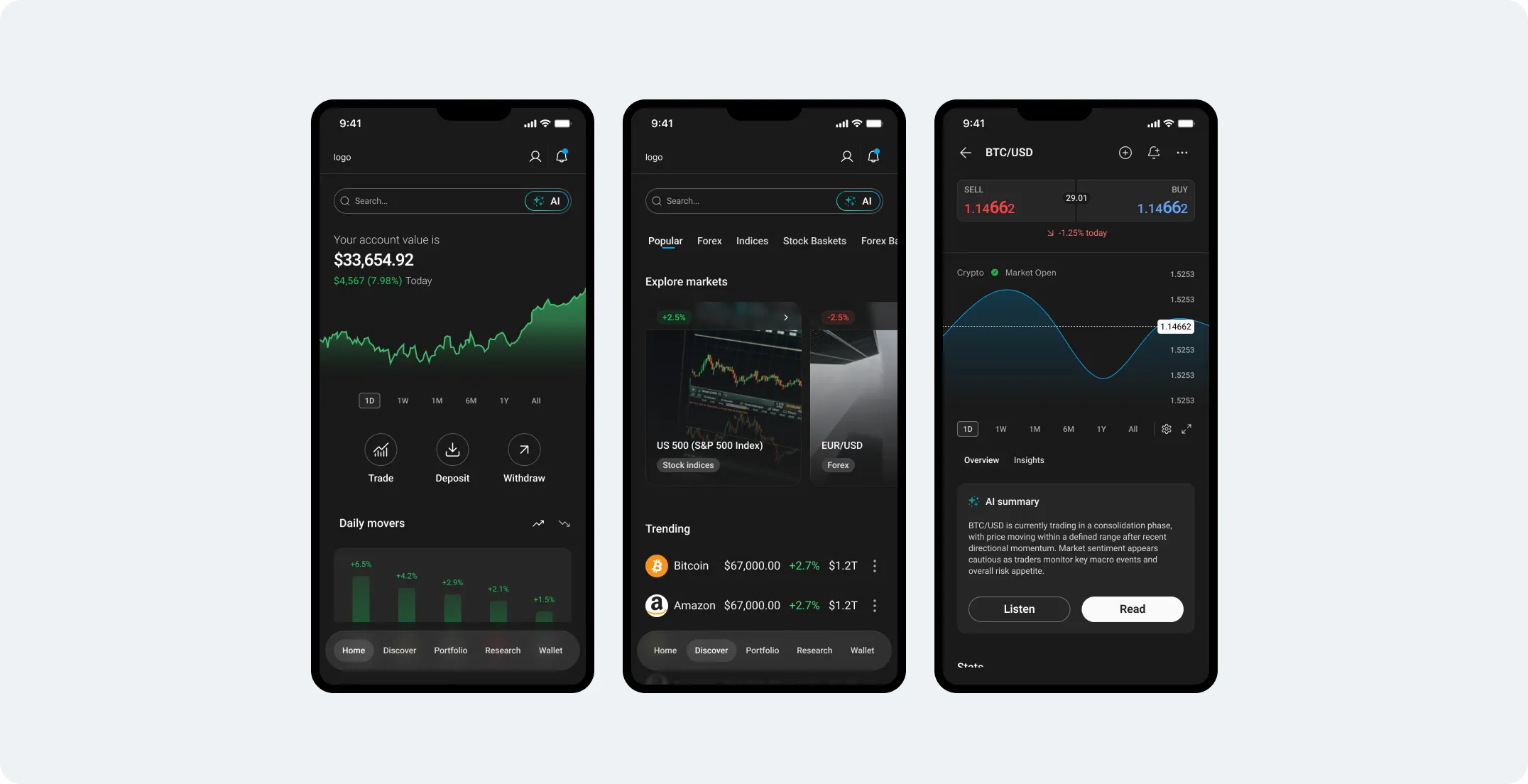
The platform connected onboarding, verification, Wallet, trading and internal operations. I worked across these areas during 2025, trying to understand what users actually needed to see and what could stay behind the interface.
01Learning the Business
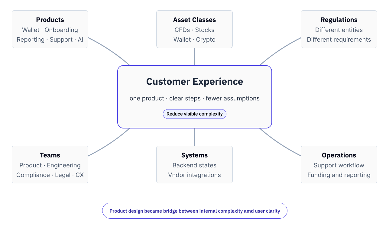
The product was more connected than it looked
On the surface, the journey looked fairly simple: open an account, add money and trade.
Underneath, those actions depended on verification, account states, payment providers, trading systems and internal operations.
Before changing individual flows, I needed to understand how those parts affected each other.
02Following the Money
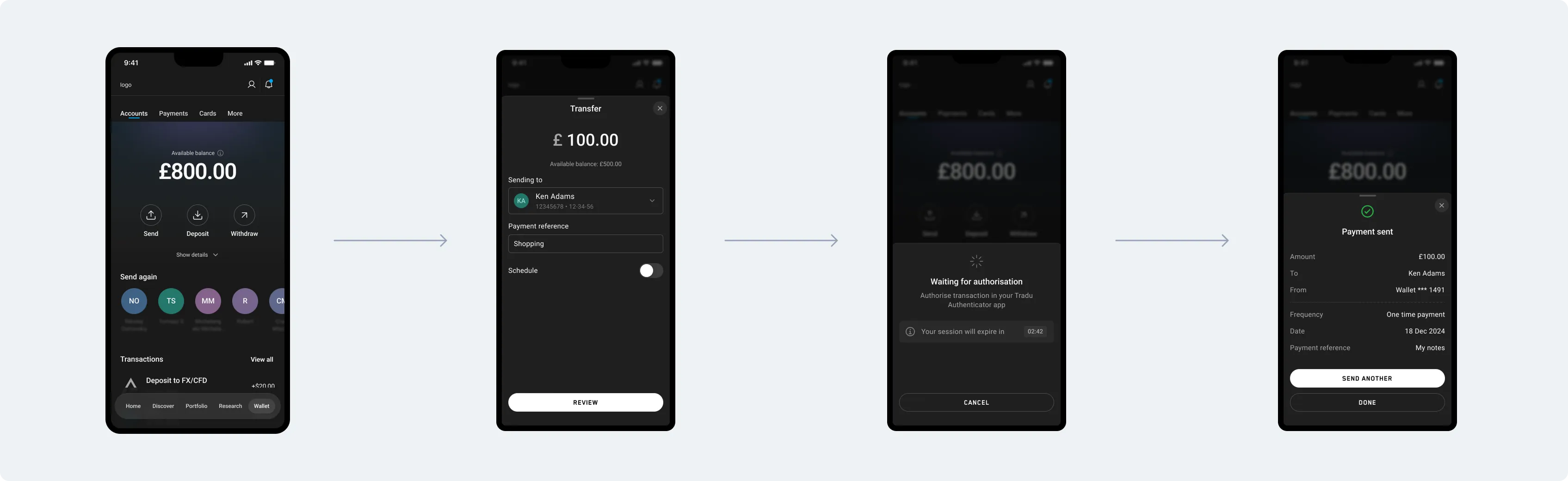
Wallet forced me to trace what happened beyond the screen
A deposit could involve payment methods, verification, account status, balance states, transfers and support. What looked like one feature was connected to much more of the product.
Mapping those relationships made the redesign easier because I finally knew what each state meant and what the user could do next.
03Seeing the Whole System
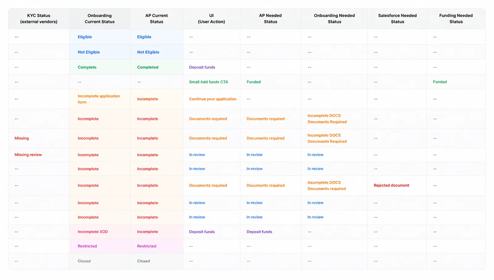
A status was rarely just a label
I started tracing where each status came from, what triggered it and what happened next.
Some were driven by verification, some by payments and others by internal operations. The interface often showed the result without showing any of the dependency behind it.
Once those relationships were visible, I could remove information without accidentally removing something the user or the business still needed.
04Designing Around Decisions
Onboarding was where everything met
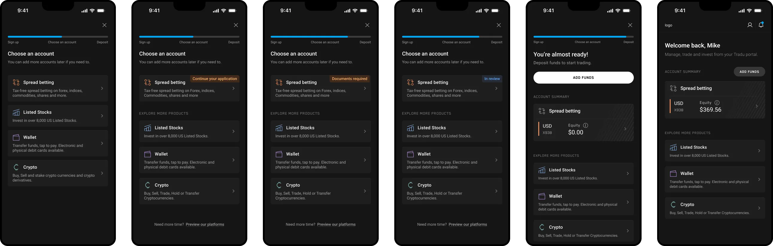
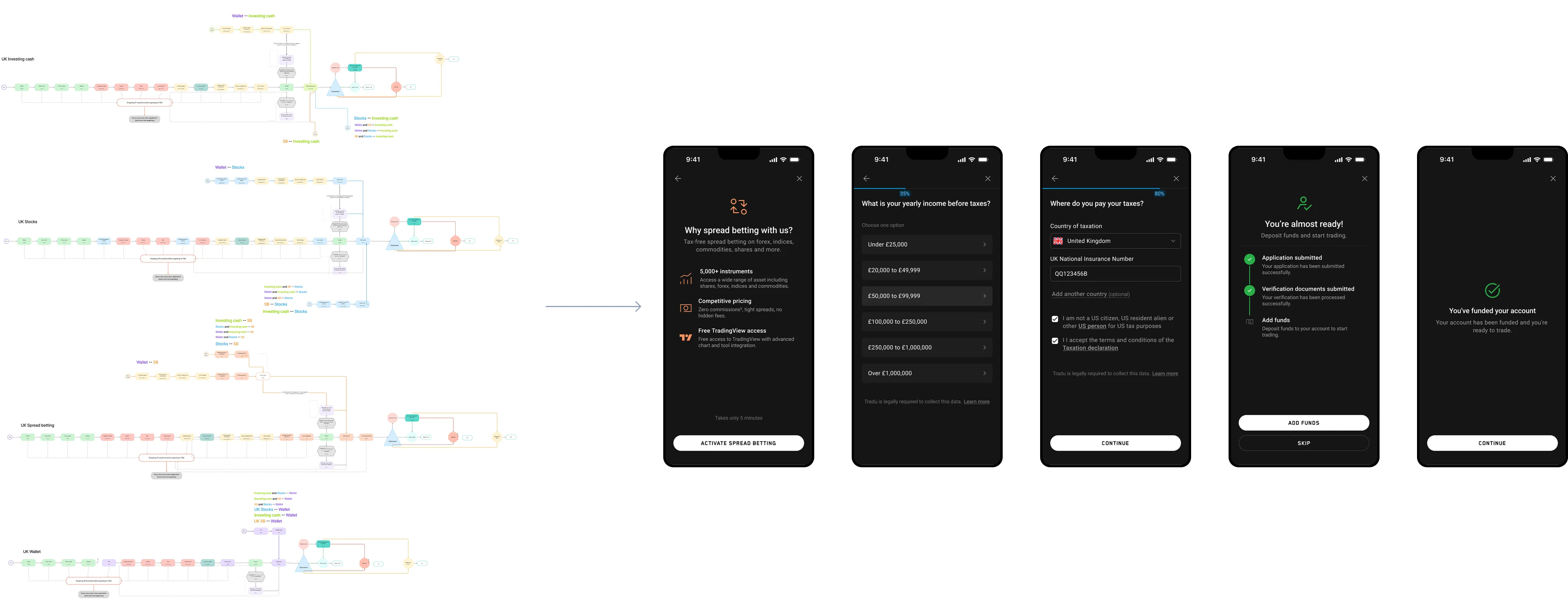
Onboarding was one of the hardest parts of the product because almost every constraint showed up there: regulation, verification, eligibility, account states, content, errors and what happened when users left and came back.
The difficult part was deciding what users needed to see while still meeting regulatory requirements, without exposing the whole process behind it.
I documented the relationships between application, verification and account states first, then used that structure to simplify the journey.
05Challenging Assumptions
Sometimes the problem was a single question
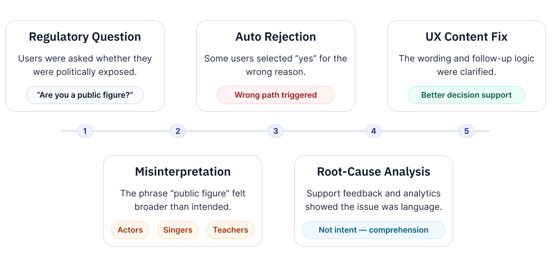
Onboarding data showed an unusual number of applicants being declined around one question about politically exposed persons.
The screen itself was simple, so I traced the wording, compliance logic and resulting account state to understand what was happening.
The question was being misunderstood. I worked through it with Compliance and changed the wording and flow.
06AI EXPLORATION
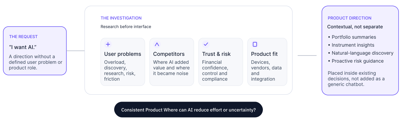
The brief was basically: “I want AI.”
That wasn’t enough to design a feature.
I looked at where users were already spending effort, what competitors were doing, what people would trust in a trading product and what made sense across mobile and desktop.
The useful ideas were contextual: summaries, natural-language discovery, smarter watchlists, inline guidance and proactive risk information.
The work stayed at exploration stage. It gave us directions worth pursuing rather than an AI feature for the sake of having one.
07PROJECT OUTCOME
What changed
- 20+
- Stakeholders
- 4
- Regulated markets
- 2
- Platforms
Onboarding launched
The redesigned onboarding went live across web and PWA.
Wallet moved into implementation
Parts of the Wallet redesign reached production while the wider work continued.
Status logic became visible
Mapping application, verification and account states gave later product work a clearer starting point.
AI became specific
An open-ended request became a set of product opportunities tied to real user problems.
08Looking Back
Reflection
By the end of the project, I was opening compliance documentation and status logic before opening Figma.
The screen had stopped being the starting point. That changed how I approached the products that came after it.