Consumer products
Discovery, content and commerce
Selected work across travel, marketplaces, health information and commercial websites. Different products with different audiences, but each needed a clear way for people to find what they came for.
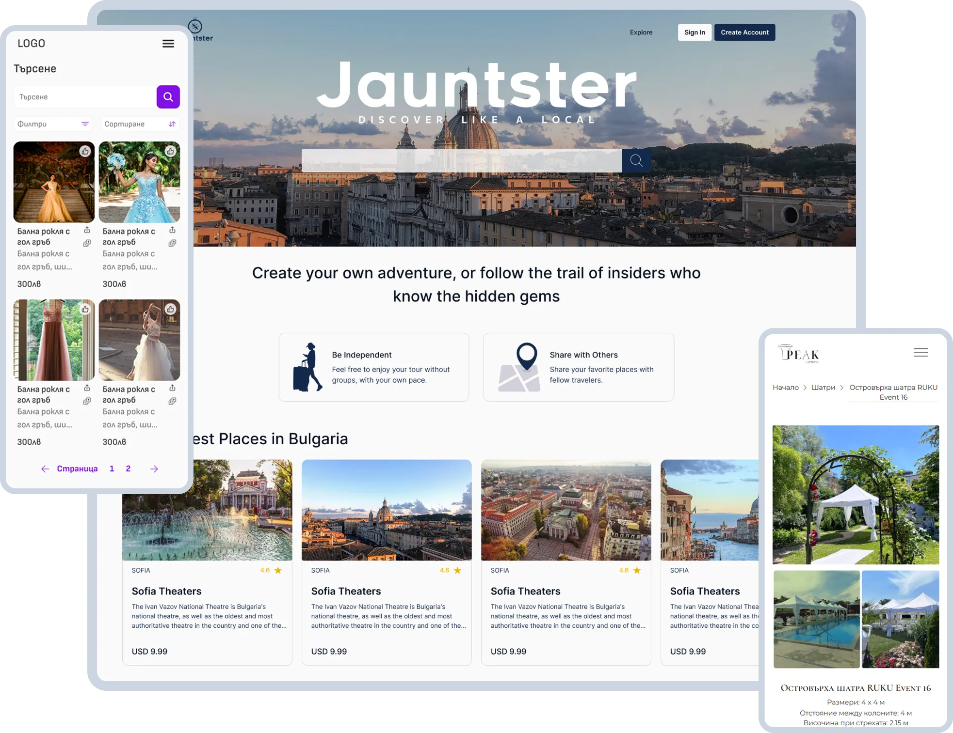
SELF-GUIDED TOURS
01the idea
A tour could come from anyone who knew a place well
The idea was simple. You arrive somewhere, find a tour that interests you, buy it and explore at your own pace.
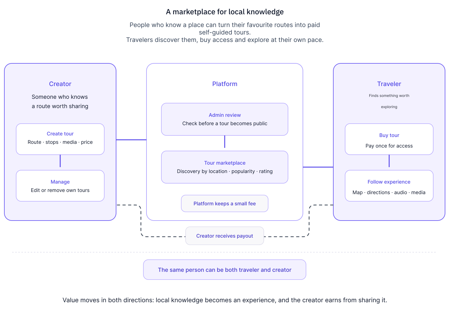
The creator didn't have to be a travel agency. It could be someone who knew the best museums in their city, had a favourite nature route or wanted to share a good walk for families with children.
The same person could be a traveller and a creator.
Tours went through admin approval before publishing. Creators set their prices, and the platform kept a small fee from each sale.
I liked the concept because I would genuinely use both sides of it.
02THE TOUR EXPERIENCE
Choosing a tour and walking it needed different interfaces
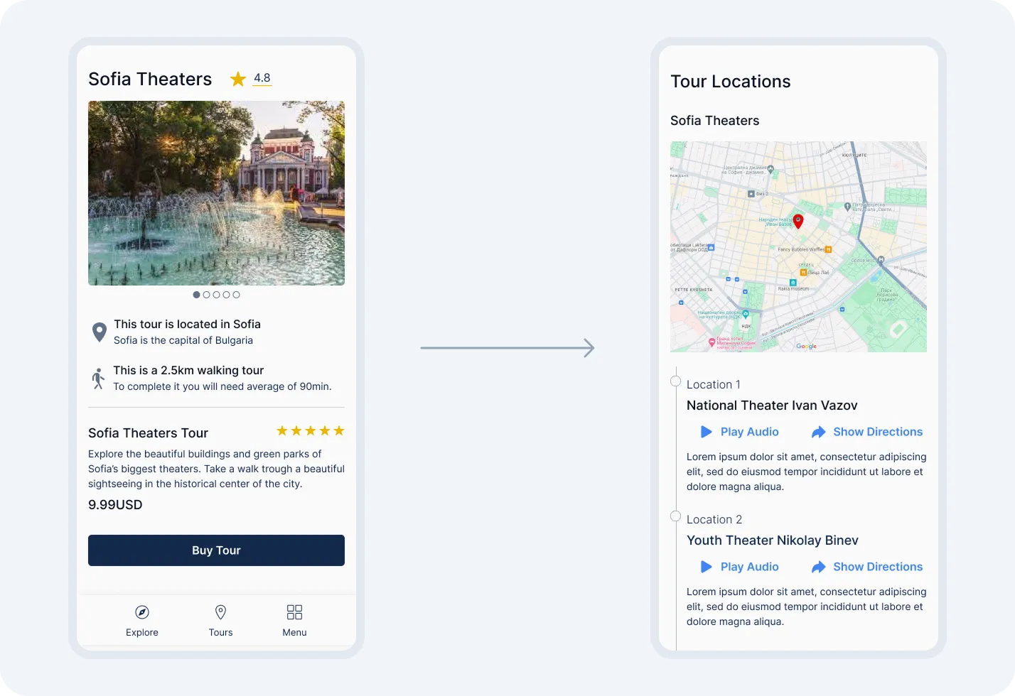
Before buying, people needed to see the location, description, tour type, rating, price and information about the creator.
Once they started walking, those details became secondary.
They needed their current location, directions, the next stop and the content attached to it.
We focused particularly on audio. Someone exploring outside might struggle to see their screen in bright sunlight, and walking while constantly looking at a phone isn't ideal either.
Google Maps provided navigation and location detection. Users could choose when to play the audio.
Some tours allowed people to start from any stop and explore freely. Others followed a fixed order when the experience depended on it.
03TOUR CREATION
Creating a tour was the harder part
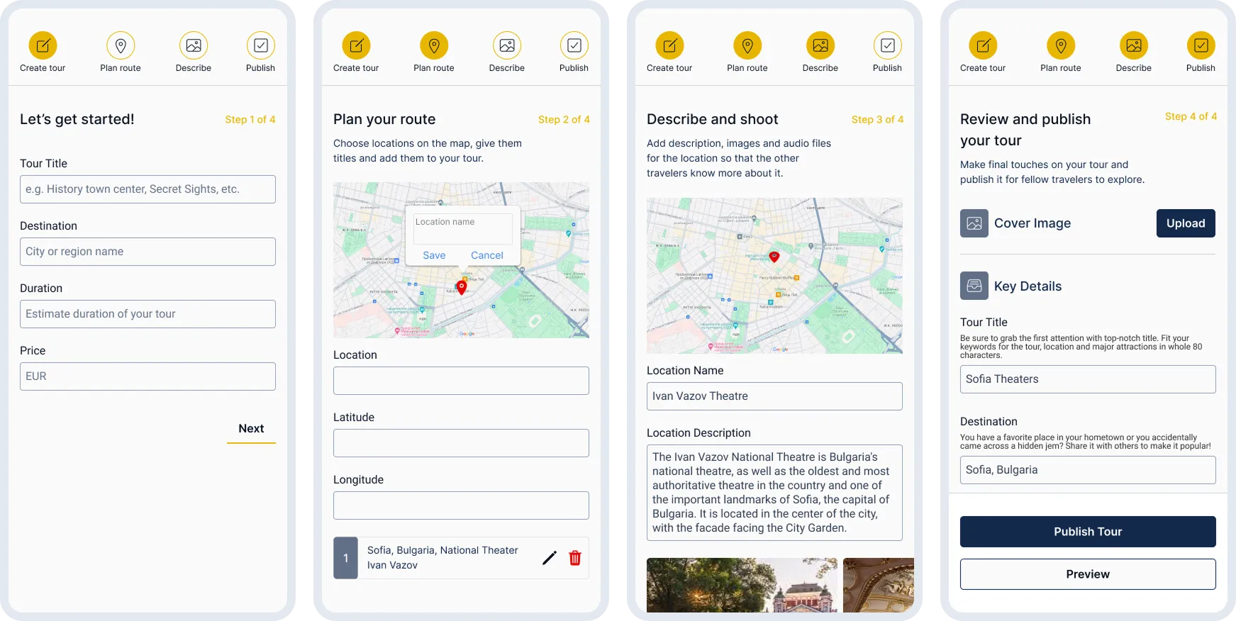
A creator needed to add general information, stops, route details, descriptions, images, audio, video and pricing.
That was a lot to ask from someone who might be creating their first tour.
I used a wizard to guide the initial setup. After the first step, creators could move between sections and fill them in any order.
They still had a clear structure, but didn't have to prepare every piece of content in a fixed sequence.
The creation flow is probably the part of this project I like most.
04WHAT HAPPENED
I still think this could have been a real product
The design and implementation were completed, but the project stopped before launch. The client decided he did not want to take on the marketing and operational work that would come after the product was built.
It is still my favourite of the consumer projects because I would genuinely use it from both sides: as someone buying a tour and as someone creating one.
ABIBAL
01the idea
We designed the filters before there were dresses to filter
Abibal was a marketplace for second-hand prom and wedding dresses.
Prom is a big event in Bulgaria. Dresses can be expensive, often custom-made and sometimes worn only once. The platform gave people somewhere to resell them.
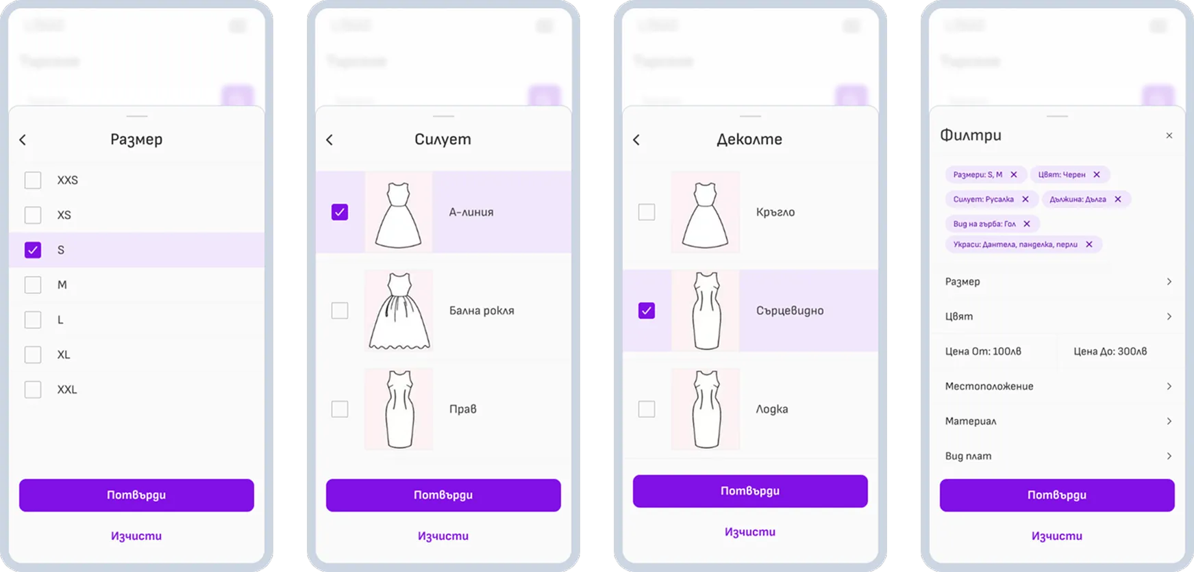
The client wanted detailed classification from the beginning: silhouette, length, sleeve type and many other attributes. Some options even needed illustrations to explain what they meant.
I thought it was too much for a marketplace starting with no listings, but the client wanted to prepare for a much larger catalogue.
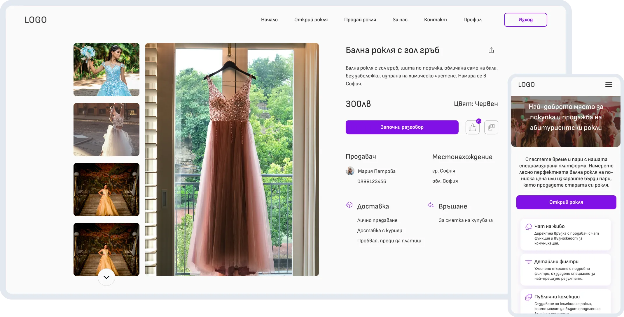
I kept the main experience simple: browse, open a listing, save or share it, and contact the seller directly.
The detailed filters were there when someone needed them.
I still think there are too many.
02WHAT HAPPENED
The simple part was the part that mattered
Abibal launched and went live with real listings. The core journey stayed simple: browse, open a listing, save or share it, and contact the seller directly.
That part worked better for me than the full filtering system. The filters were there if someone wanted them, but the marketplace did not depend on them to be usable.
If I were reworking it now, I would simplify the filtering substantially. I still think the main value of the product was giving people an easy, low-risk way to buy and sell occasion dresses that would otherwise be worn once and forgotten.
HEALTH INFORMATION
01the idea
People arriving here didn't need more alarm
This project started with a developer I had worked with before. She has cystic fibrosis and felt that the existing association website wasn't doing enough for people affected by the disease.
She wanted us to create something better and offer it to the association. I joined the project without charging for the work.
02CONTENT AND SCOPE
Support mattered more than adding features
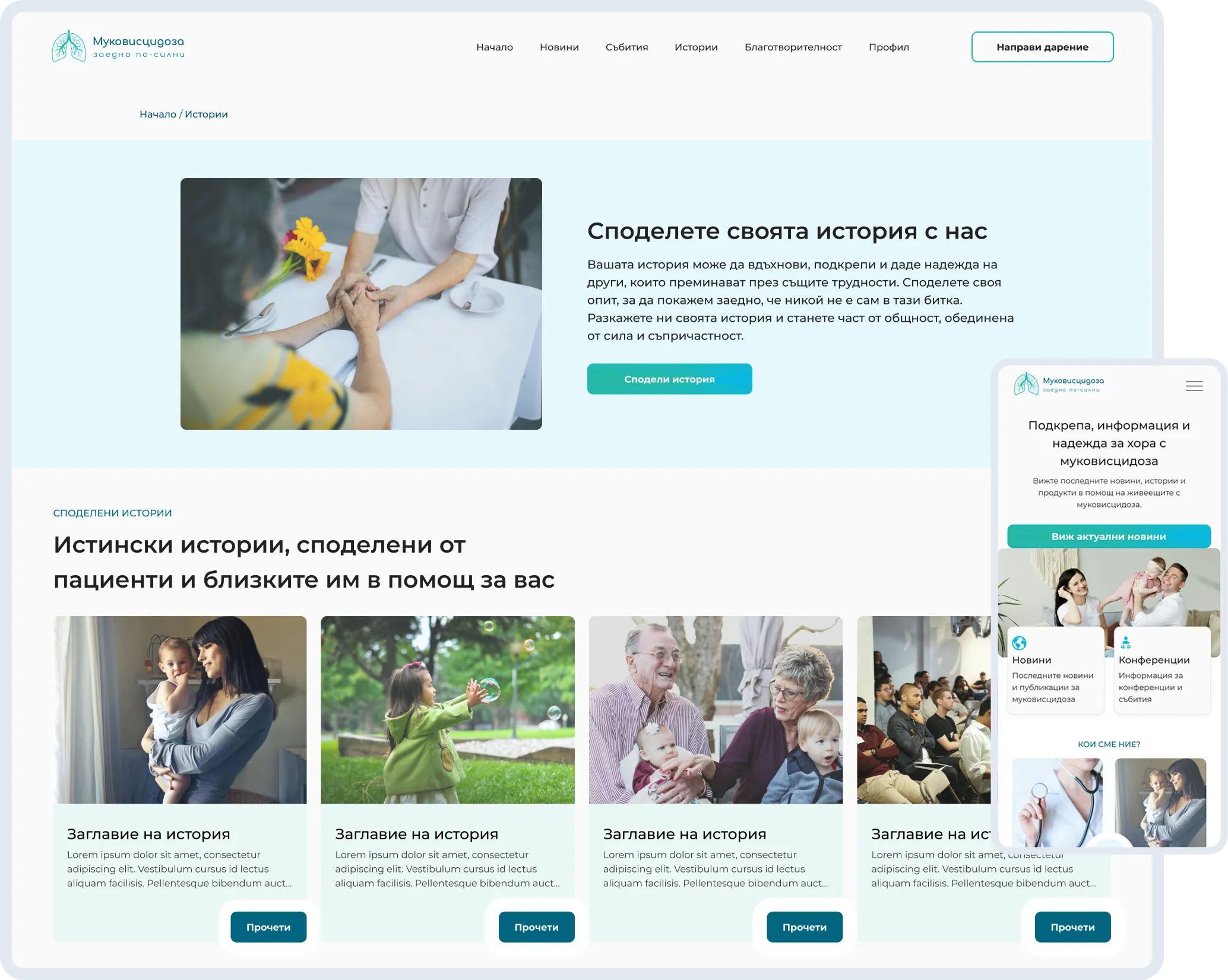
I kept article layouts and behaviour consistent across content types. People had enough to think about without having to learn a different page structure every time.
The concept included ideas for donations, a small marketplace and eventually online medical consultations. I would narrow that scope today and focus on information and support first.
The site was never presented to or approved by the association, so it remained a design concept.
PEAK CATERING
01the idea
The challenge was organising the inventory
The company supplied event inventory. It didn't cook, decorate or organise events itself, although it worked with businesses that did.
Its customers included event planners, catering providers, companies and people organising private parties.
The inventory was enormous, covering everything from furniture and serving equipment to textiles and napkins.
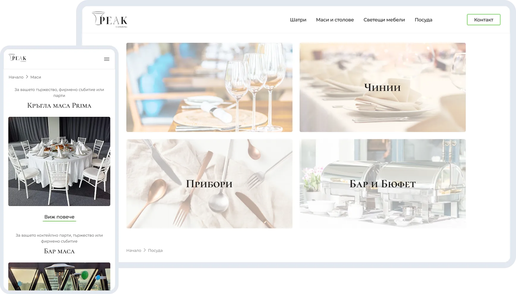
I spent most of my time working out the categories and where each type of item belonged.
The main journey was straightforward: find the category, browse the inventory, check the item and contact the company.
02IMPLEMENTATION
Then I had to build it
Peak Catering was also my first Webflow project.
I worked on the branding, information architecture, UI, responsive designs and CMS, then built the website myself.
The final site stayed very close to the Figma designs.
What I remember most from implementation is CSS classes. And combo classes. And how quickly they become a mess when you're not careful.
It made me much more conscious of how I structure reusable elements.
PROJECTs OUTCOME
What happened
Self-Guided Tours
Design and implementation were completed, but the client decided not to continue towards launch because he wasn't ready for the marketing and business work.
Abibal
Designed from scratch, built and launched. The marketplace went live and has real listings.
Health information
The concept was completed but never presented to or adopted by the association.
Peak Catering
Designed and built in Webflow. The website launched and established the company's online presence.
Looking Back
I would redo a lot of the UI
What I'd change now
Abibal still has too many filters. I'd narrow the medical website's scope, particularly the marketplace and consultation ideas.
Building Peak myself taught me how quickly poorly structured CSS classes become a problem.
Self-Guided Tours is the one I'd happily return to. I still like the creation flow, the walking experience and the idea of people sharing places they know well.