Design System

Building a Shared Language Across Design and Engineering

Built while designing real products - not as a standalone initiative.

Role

Product Designer

TIMELINE

Jan 2026 – Ongoing

PLATFORMS

Web • iOS • Androind • PWA

focus

Design System • Cross-platform • Design - Engineering Workflow

01

/

The Beginning

Before Building Anything, I Needed to Understand How We Worked

The same decisions kept resurfacing across products and platforms: how a button should behave, what a status meant, which colour or spacing value to use. Each team had an answer, but there was no shared one. That was where the system started.

When I joined the company, I was focused on learning how the products worked.

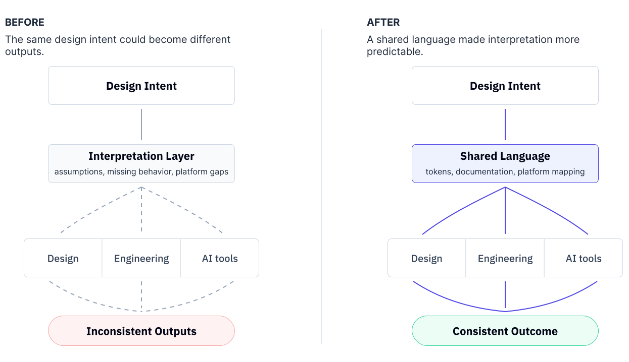
The more projects I worked on, the more often I ran into the same issues. Similar components existed in different versions. Developers interpreted Figma files instead of building from shared patterns. Small decisions kept being made more than once.

It simply made the work harder than it needed to be.

Around the same time, work on a new FXCM platform was starting. New backend. Native apps. Web. PWA.

It felt like the right moment to question how we wanted to build products going forward.

Instead of solving the same problems in every new project, my manager and I started discussing whether we could solve them once.

That conversation eventually became the Design System.

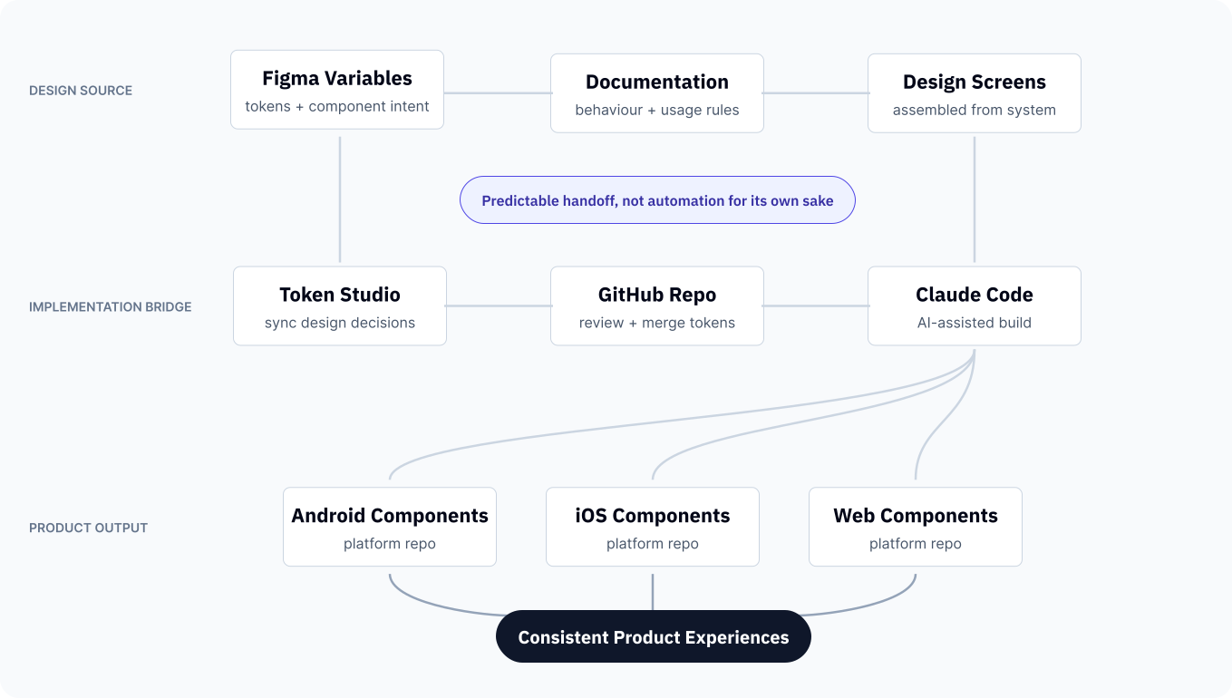
The workflow connected documentation, tokens and code into a single implementation process instead of separate handoffs.

02

/

Seeing the Pattern

Every New Project Started with the Same Conversation

Working on more products made it easier to see that the issue wasn't a particular feature - it was how we were building them.

In every new project the conversations were the same. Wallet. Then Onboarding. Support. Reporting. New concepts for FXCM.

A button behaved one way in one product and differently in another.

Components were recreated because there wasn't a shared version to start from.

Developers asked the same implementation questions because every Figma file had to be interpreted separately.

Nothing was seriously broken.

The issue was that everyone was solving the same problems independently.

After a while, it became difficult to ignore.

Fixing individual screens wasn't changing the way we worked.

That was the point where I started looking at the system behind the separate projects.

Every project looked different on the surface, but they were repeatedly solving the same underlying problems. Recognizing those patterns became the starting point for building a shared system.

03

/

Starting with the Basics

Buying a Design System Wasn't Enough

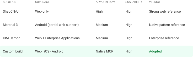
Before building anything ourselves, we explored existing libraries. The more we investigated them, the clearer it became that we were trying to solve a different problem.

Our first instinct wasn't to build a Design System from scratch.

My manager asked me to investigate existing solutions that we could buy, customise and expand over time.

As I went through the most common libraries, one limitation kept coming back.

Most systems were designed primarily for the web. They offered excellent React components, but our roadmap looked different. We were preparing a platform that would run on web, native iOS, Android and PWA. Reusing the same design language across all of them was more important than reusing the same code.

At the same time, I started exploring another idea on my own. Instead of adapting an existing library, what if we built the foundations ourselves and let every platform implement them in its own way?

I put together a small proof of concept and shared it with my manager. We reviewed it together, validated the approach with engineering and compared it with what I had learned during the investigation.

From that point on, the direction became much clearer.

We were deciding what would give us the best chance of building one shared product across four platforms.

The platform strategy became the deciding factor, not the component library.

Instead of starting with a component library, we first identified the product decisions that needed to remain consistent across every platform.

04

/

Testing the Idea

One Button Was Enough to Validate the Approach

Before investing time in a full Design System, we wanted to know whether the workflow actually worked.

I started with the foundations - establishing and building the token structure and creating the button component.

Once the button and its documentation were ready, I handed the file over to engineering. Together we tested whether Claude Code could understand the documentation, generate the component and match it to the design.

It worked.

That small test gave us confidence that the workflow made sense, not just the component itself.

From there, expanding the library became a much safer investment.

The first component validated the process.

Shared semantics became the foundation that connected design decisions to platform-specific implementation.

05

/

Building Together

A Component Wasn't Finished Until Everyone Could Use It

Designing the component was only one part of the job. It also needed to be understood, implemented and maintained.

Once the foundations were in place, building new components became much more predictable. Each one reused patterns we already trusted.

The documentation evolved alongside the library. It described behaviour, usage, rendering rules and platform differences, so designers, developers and AI-assisted workflows could all work from the same source of truth.

At the same time, we established the workflow between design and engineering. I managed tokens in Figma, pushed updates through Token Studio, and engineering reviewed and merged them before generating platform-specific components.

The component was finished when everyone could use it the same way.

Components only became valuable once they could move consistently from documentation to implementation across every platform.

06

/

BUILT-IN QUALITY

Accessibility was built into the system, not checked at the end

Accessibility requirements were defined at the foundations level and carried through variables, components and documentation.

When building the color system, I validated semantic combinations against WCAG across light and dark modes, compared the results with APCA to better understand the differences between the two models, and reviewed key screens through color-vision simulations.

Touch targets for iOS and Android were added directly to the variables used by designers, Claude Code and engineering. Each component was also documented with accessibility guidance, allowing those decisions to be inherited by new product work rather than reconsidered feature by feature.

The aim was was to make the accessible choice the default choice across design and implementation.

Once touch targets, contrast requirements and usage guidance were built into the system, accessibility no longer depended on someone checking it at the end.

Accessibility shouldn't depend on whether someone remembers it during implementation. The system should carry those decisions forward automatically.

07

/

Designing the System

Documentation Was Part of the Product

I didn't see documentation as something to write after the work was finished. It became part of the design process itself.

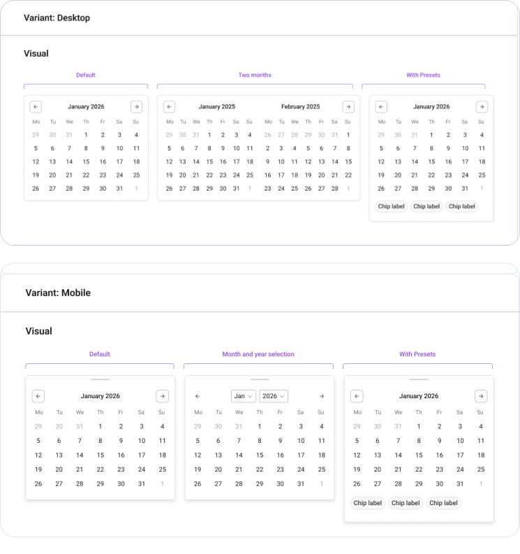
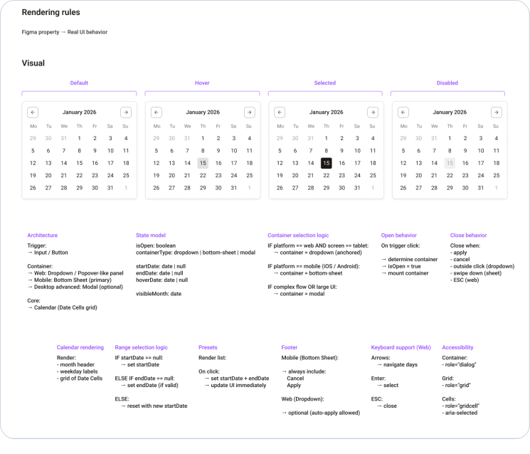
Every component included its anatomy, variants, behaviour, rendering rules, platform differences and implementation notes. The goal was to remove as much interpretation as possible.

This became one of the most interesting parts of the project.

Documentation became a second design problem: what would someone need to understand the anatomy, variants, platform differences and accessibility requirements without asking me? Answering that question changed how I designed the components themselves.

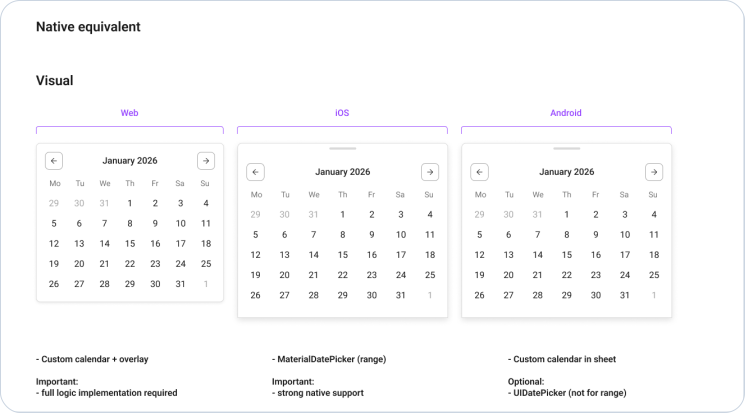
Different platforms. Same intent. Clear behavior.
Behaviors are defined, not assumed.
Why is this important
By mapping components to their native equivalents, we reduce development ambiguity and ensure the user experience feels native on every platform.
One component. Native in every platform.

08

/

PROJECT OUTCOME

How the system changed the way we build products

3

Product Teams

10+

Engineers

4

Platforms Supported

Shared language across teams
Design and engineering now shared the same semantic language, reducing translation between design and implementation.
Default starting point for new work
New product work started from the same reusable foundation instead of rebuilding patterns from scratch.
Documentation became implementation guidance
Documentation became part of implementation, giving designers and developers a shared reference throughout delivery.
One foundation across four platforms
A single design system supported web, iOS, Android and internal products, creating a consistent experience across platforms.

09

/

Looking Back

I Didn't Set Out to Build a Design System

I was trying to make everyday work a little easier. The project ended up changing much more than that.

At the beginning, I thought mostly about components. They were the visible part of the work, so naturally they felt like the priority.

That changed quite quickly.

The more time I spent building the system, the more I realised that components only solved mostly the design side of the problem.

People also needed a shared understanding of how those components should behave, when to use them and how they would be implemented.

That's where the documentation became just as important as the components themselves.

The system stopped feeling finished the first time someone had to use it without me in the room. Questions about variants, platform differences and accessibility showed where the documentation was still relying on context I had never written down. That is closer to what “finished” means to me now: usable without its author standing beside it.