Trading experience

Helping Users Move Through Complexity Without Needing to Understand It

Understanding the relationships behind the product made it possible to design experiences that felt simpler without removing necessary complexity.

Role

Product Designer

TIMELINE

Jan 2025 – Dec 2025

PLATFORMS

Web • PWA

focus

Internal Systems • Wallet • Trading app • Onboarding • Reporting • AI

01

/

Learning the Business

Helping People Invest Without Asking Them to Understand the Platform

Before simplifying the experience, I needed to understand how the product, regulations and business rules worked together.

When I joined Tradu, the product already existed. It had been designed and built by external vendors, and new features were gradually being brought in-house.

I started with the Wallet, but quickly found myself working across onboarding, reporting, support and AI concepts. Although they looked like different projects, they all depended on the same product and many of the same systems.

Soon it became clear that most user problems didn't start in the interface. They started much earlier, where compliance requirements, business rules and technical constraints met.

Understanding those relationships became part of the design process.

It made it much easier to decide what users actually needed to see, and what the product should handle for them instead.

Understanding the product ecosystem made it easier to see where users became uncertain and where design could remove that complexity.

02

/

Following the Money

The Wallet Helped Me Understand the Product

What I learned while designing the Wallet became the foundation for every project that followed.

At the beginning I was focused on the user flows. Financial operations, onboarding, reporting  and processing states taken out of context looked like separate features.

Diving in deeper into the system I realised how everything is tightly connected. A deposit affected onboarding. Verification affected funding. Trading affected available balances. Even small interface decisions depended on rules that lived somewhere else in the product.

Designing the Wallet meant learning those relationships first.

That understanding stayed with me long after the project was finished. When I moved on to onboarding and reporting, many of the questions had already been answered.

The Wallet project became my introduction to how the whole product worked.

03

/

Seeing the Whole System

Investigating Statuses Changed the Way I Looked at the Product

This was the point where individual projects stopped feeling like separate pieces of work and started making sense as one connected experience.

The Statuses project looked fairly straightforward. The task was to help users understand where they were in the onboarding process and what needed to happen next.

As I started mapping the different states, the challenge was understanding everything happening behind them.

Each status represented the outcome of multiple systems working together. Users didn't need to understand any of that, but the interface needed to communicate it clearly enough that they always knew what was happening and what to do next.

I started asking how they connected to the rest of the product and what users actually needed to see at each step.

Statuses made it clear how every interaction between internal systems can affect the client-facing part.

This also meant that paying attention to even the smallest details sometime can have huge impact.

Statuses became the product's way of communicating progress, not just another collection of interface screens.

04

/

Designing Around Decisions

Understanding the Process Made It Easier to Simplify It

Once I understood how the different parts of the product worked together, the design questions started changing.

I found myself asking what users needed in order to move forward and do the job they use our app for.

That became especially important in onboarding.

Identity verification, regulatory requirements and document uploads introduced complexity, but users only needed enough information to complete the next step with confidence. That principle shaped everything from application statuses to error messages and regulatory questions.

That changed many of the design decisions.

We simplified application statuses, clarified regulatory questions, improved error handling and rewrote parts of the experience where the interface was exposing internal logic instead of helping users complete their task.

My job was deciding which parts users needed to think about and which parts the product should handle for them.

Mapping the application, verification and account states made the hidden dependencies visible. Then I could simplify what users saw without removing what compliance and operations still needed.

05

/

Challenging Assumptions

Sometimes the Problem Was a Single Question

One small piece of copy was creating unnecessary friction for users and extra work for the business.

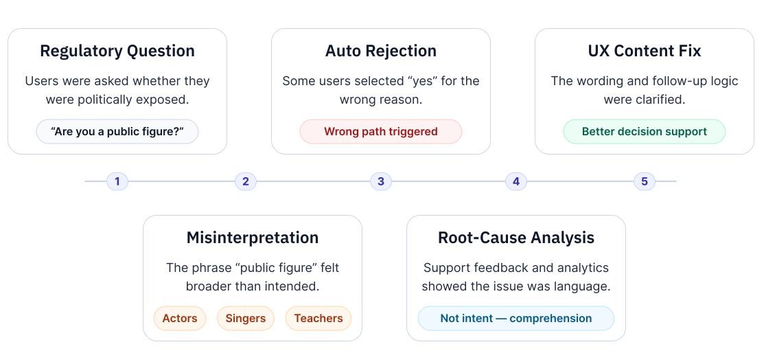
While monitoring onboarding performace, I noticed an unusually high number of applicants declined. Users were identifying themselves as politically exposed persons (PEPs).

After looking into it, the issue wasn't the regulation itself. Many users simply interpreted the question differently from what compliance intended. The wording encouraged people to answer cautiously, even when they didn't meet the actual definition.

I brought the issue to the compliance team, and together we reworked the wording and follow-up flow.

The interface changed very little, but the experience improved significantly for both users and the business.

One of the most consequential onboarding changes was rewriting the public-figure question so users understood what was being asked before their answer triggered the wrong outcome. The regulatory requirement was still met but the misunderstanding was avoided.

The solution wasn't changing the compliance process. It was making the intent behind the questions easier to understand.

06

/

AI EXPLORATION

Finding a Useful Role for AI in the Product

A broad executive request became a structured investigation into where AI could reduce effort, uncertainty and information overload without taking control away from users.

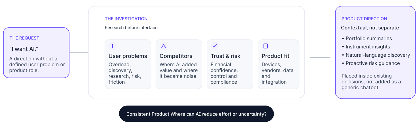
Leadership asked for AI, but no specific feature or user need had been defined. Before moving into interface concepts, I investigated where customers were already losing time, context or confidence across the trading experience.

I reviewed app feedback, community discussions and industry research, then grouped the recurring problems into seven areas: information overload, difficult discovery, manual research, complex interfaces, risk blind spots, execution uncertainty and fragmented multi-asset experiences.

I compared competitor approaches, attitudes toward AI in financial decisions, mobile and desktop behaviour, and the capabilities of potential vendors and regulatory constraints. This helped separate useful product opportunities from AI added simply for visibility.

The resulting direction focused on contextual support: concise portfolio and instrument summaries, natural-language discovery, smarter watchlists, inline guidance and proactive risk communication. AI would appear inside existing decisions rather than becoming a separate destination.

AI should reduce effort without taking control away.

The exploration shifted the conversation from where to add AI to where it could genuinely reduce effort and uncertainty.

07

/

Connecting the Product

The Same Questions Started Shaping Every New Feature

By this point, the projects no longer felt unrelated. The more I understood the product, the more often I found myself solving the same type of problem in different places.

Whether I was working on reporting, support, website navigation or early AI concepts, the questions were surprisingly similar.

What does the user need to know?

What can the product handle instead?

Where should information live so people don't have to look for it twice?

Those questions influenced decisions well beyond onboarding.

Once I understood how the product worked, the design language naturally became more consistent across the platform.

Different features asked different questions, but they all followed the same principle: understand the problem before designing the interface.

08

/

PROJECT OUTCOME

How the product became easier to navigate without becoming simpler

20+

Stakeholders

4

Regulated Markets

2

Platforms Supported

Aligned a large cross-functional programme
Design decisions brought together approximately 40–50 stakeholders across product, engineering, compliance, legal and business around a shared onboarding experience.
Reduced unnecessary friction
Simplified regulatory journeys by restructuring onboarding flows, improving guidance and reducing confusion without compromising compliance requirements.
One experience across platforms
The onboarding framework was designed for both web and PWA, creating a consistent experience across supported platforms.
Built for long-term evolution
The onboarding architecture supported multiple regulated products and future expansion without redesigning the experience from scratch.

09

/

Looking Back

Tradu Changed the Questions I Ask

This project taught me that good product design starts long before the first screen.

When I started this project, I focused on improving individual experiences.

Today, I start by understanding how the product works before deciding what needs to change.

By the end of the project, I was often opening compliance documentation and status logic before opening Figma. The starting point was the result of understanding everything that had to happen around it.